Palettes
The project makes it easy to use and customize colourmaps to make better scientific visualizations. Check it out on GitHub!
Why this project?
Colour is incredibly important in visualizing scientific data. However, colour can contribute to your visualizations being inaccessible to people with colourblindness, and can introduce ghost artifacts into your results. See this EOS article for some more detail on this issue.
The SciVisColor website provides some excellent colourmaps. This package provides easy access to these colourmaps for both Matlab and python. It also lets you customize colourmaps - see the example below!
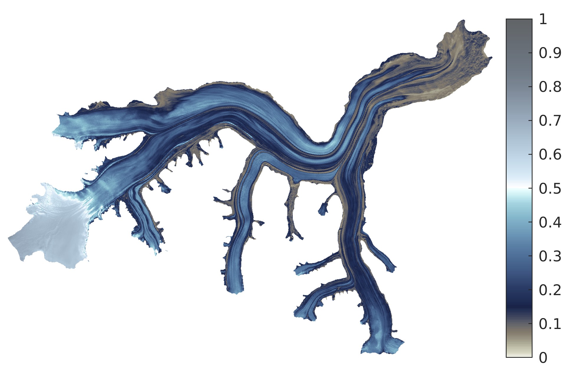
This figure shows the albedo derived from Landsat 8 imagery over Kaskawulsh Glacier, Yukon Territory, Canada (from doi:10.1017/jog.2020.106) visualized with a custom “3-wave” colourmap. While this visualization is not the best quantitative representation of the albedo, the colours chosen intuitively represent dirty/debris-covered ice for albedos below 0.15 and snow for albedos above 0.5.